Task: to design a building, that is, a formal composition occupied by human activities. A bulding that will become a dealer's art gallery that specialises in contemporary and experimental art. The dealer chooses to work and live in one place; therefor, part of the gallery is also the dealer's house.
Sunday, May 30, 2010
PROJECT 3: Art Gallery
Task: to design a building, that is, a formal composition occupied by human activities. A bulding that will become a dealer's art gallery that specialises in contemporary and experimental art. The dealer chooses to work and live in one place; therefor, part of the gallery is also the dealer's house.
Friday, May 28, 2010
Site: Newtown
Newtown is located approximately 4 kilometres south-west of the Sydney central business district and lies across the local government areas of the City of Sydney and Marrickville Council. King Street is the main street of Newtown and centre of commercial and entertainment activity. Enmore Road branches off King Street towards the suburb of Enmore at Newtown Bridge, where the road passes over the railway line at Newtown Station.
Enmore Road and King Street together comprise a 9.1 kilometre round-trip of some 600 shopfronts. The main shopping strip of Newtown is the longest and most complete commercial precinct of the late Victorian and Federation period in Australia. The Newtown area is also known for its creative graffiti and "street art". The most prominent of these works are the large murals created in the late 1980s and early 1990s, which were painted on the walls of houses and shops in the Newtown-Erskineville area.

Thursday, May 27, 2010
Factors to consider:
- Location, height, type of neighbouring buildings
- Sun paths
- Overshadowing by neighbouring buildings and vegetation
- Views (of the City, of vegetation, street life)
- Access (pedestrian, vehicular, disabled)
- Acoustic environment
- Materiality of neighbourhood (facades, paving)
- Overlooking of site by neighbouring building
- Wind direction
- Trees & other vegetation
Wednesday, May 26, 2010
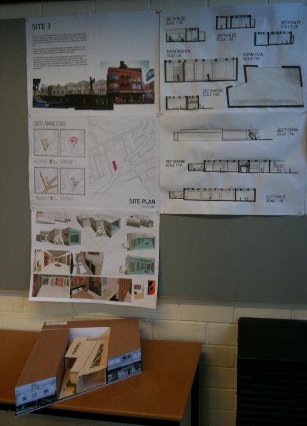
Site 3:

Site 3 is located at 270 King Street, Newtown and contains a two level building that is positioned between two other buildings on King Street. One of the neighbouring buildings is two storeys and the other is three storeys. Majority of the buildings along King Street contain awnings and traditional ornamentation. The site contains a very irregular perpendicular frontage of 16,000 mm, one length of 44,000 mm and another of 33,000 mm. The buildings main face is a rendered brick surface similar to the neighbouring buildings.
The site boasts a busy location next to a major bank. Also behind the site is a convenient community carpark. The layout of the carpark and rear lane would permit easy access for delivery trucks whilst also allowing a private entrance to become possible. The pathways for pedestrians on King Street are just over 3,000 mm, which encourages consistent movement from both locals and visitors.

Monday, May 24, 2010


Abstract Art:
- Abstract art uses a visual language of form, color and line to create a composition
- Cubism was the first ‘abstract’ art style
- Abstract art allowed a new way of seeing things in art to be formed
- Expresses feelings coming from reality
- Strong use of geometry and grids
- Creates an energy we cannot see but feel
- Most appropriate style of art to market within Newtown in regards to the fashion and personalities of locals and visitors

Kandinsky commonly explored geometry, lines and other abstract forms throughout much of his artworks. I have used a specific form from one of his paintings and formed a grid which has become a significant element with my gallery plan.

Saturday, May 22, 2010
First Draft Design concept:

After researching abstract artworks and artists, several shapes, forms, colours and grids became repetitive and present throughout many of the works. I decided to take one of the common grids and forms and combine them to form the grid and plan of my art gallery. After a critique session, it became clear that I had taken the abstract form and shape idea too far and now, my main intention to have a simple design with excessive functionality and effectiveness was no longer present.
I stripped the plan back significantly and used one section of the plan and enlarged it and edited it to become the plan itself. My design concept developed to become simplistic, practicing the notion that “less is more”.

Wednesday, May 12, 2010
Second Draft Design concept:
My main intention was to form a gallery which is minimal in design yet remains a building that is exceptionally functional and effective as a space for both the gallery owner and the Newtown Public. My gallery an inviting open and flowing space which acts as a large scale transition volume from Newtown’s main street; king street in and through the two major gallery spaces out to the simple courtyard. Mies Van Der Rohe’s theory of less is more can be seen throughout the design and planning of the Circle and Square Art Gallery.


Before entering the Gallery space, the viewer is faced with the large glass façade which instantly introduces the artwork to the public. The sculptures present along the path to the gallery entrance works as another form of enticement. Immediately we are presented with a gallery where the external walls are slightly offset. The building becomes a work of art within itself and plays as a representation of the abstract artwork being displayed and sold.

After completing my second conceptual design there were several design elements which were lacking in function, practicality and efficiency. These included the courtyard plan, the location of the gallery entrance, the glass roof panels and the large sculpture at the front of the site. My third and final conceptual design addressed and resolved, each of these issues allowing the functionality and plan effectiveness to be increased.
Tuesday, May 11, 2010
Final Design Concept and Presentation:

The building I have designed speaks to the public and expresses itself as a piece of abstracted art and therefore before entering the gallery, the public already become aware of the style of art being displayed and sold.
The gallery space is to constantly change and adapt to the upbeat energy of Newtown. The art gallery will continually present exciting, dramatic and provocative works of art to the people of Newtown.
Photos of site and art style chosen to be displayed and sold:

Abstract art seems to be the most relevant style of art to market within Newtown in regards to the personalities, fashion and energy present within the suburb.
Floor Plan and Roof Plan Scale 1:100:

The architecture becomes a work of art within itself displaying abstracted elements and forms. Famous Kandinsky artworks were used to form the plan, grid and roof system of the art gallery. The different forms and shapes grab our attention and pull an emotional response from the viewers which keep them drawn in from King Street. Gallery contains a Minimal design yet holds high functionality and flexibility as a commercial gallery.
Although the architecture is slightly abstracted to form a connection and relevance to the artworks, the final design has become quite simple and minimal allowing the artwork to do all of the talking to the viewers with the possibility of increasing sales.
Sections Scale 1:100, Room Plan and Room Section Scale 1:50

The gallery contains large adaptable and open spaces which may house sculptures, models and paintings of all scales. The circulation path formed within the gallery contains easy transition throughout the spaces with little obstacles.
The building contains a constant ceiling height with slight level changes between each of the gallery spaces becoming gestures which create interest throughout the gallery.
Sections Scale 1:100

Perspective Vignettes of Art Gallery Interior and Exterior:

Large scale façade faces King Street and demands public’s attention with its uninterrupted mass. Façade acts as a form of enticement and provokes individuals to enter the gallery with an unintentional urge to reach the art being displayed within the façade.
Gallery contains a Minimal design yet holds high functionality and flexibility as a commercial gallery. Roofing system allows different levels of natural and artificial lighting to filter throughout the gallery.
Monday, May 10, 2010

Sunday, May 9, 2010

Saturday, May 8, 2010


Friday, May 7, 2010
Project 2: Edward Hopper
Edward Hopper was born in the small Hudson River town of Nyack, New York State, on 22 July 1882. By 1899 he had already decided to become an artist, but his parents persuaded him to begin by studying commercial illustration because this seemed to offer a more secure future.
He first attended the New York School of, then in 1900 transferred to the New York School of Art. He also worked under Robert Henri, one of the fathers of American Realism - a man whom he later described as 'the most influential teacher I had'. Hopper remained at the School of Art for seven years, latterly undertaking some teaching work himself.
He painted hotels, motels, trains and highways, and also liked to paint the public and semi-public places where people gathered: restaurants, theatres, cinemas and offices. But even in these paintings he stressed the theme of loneliness - his theatres are often semi deserted, with a few patrons waiting for the curtain to go up or the performers isolated in the fierce light of the stage. When the link between the outer world he observed and the inner world of feeling and fantasy broke, Hopper found he was unable to create.
Edward Hopper: Compartment Car
Edward Hopper took an interest in cars and trains. The artist was drawn to the introspective mood that travelling seems to put us into. He captured the atmosphere in half-empty carriages making their way across a landscape: the silence that reigns inside while the wheels beat in rhythm against the rails outside, the dreaminess fostered by the noise and the view from the windows – a dreaminess in which we seem to stand outside our normal selves and have access to thoughts and memories that may not emerge in more settled circumstances.
The woman in Hopper’s Compartment Car seems in such a frame of mind, reading her book and shifting her gaze between the carriage and the view.

Edward Hopper
Compartment C, Car 293 1938
Oil on canvas
50 x 45 cm
Thursday, May 6, 2010
Narrative:
Trapped in her past, returning home is the only way she can escape.
Narrative explanation:
A wife and mother of two became friends with a man who recently moved into the small town she lived in. The man quickly became obsessed with the woman and the idea of them being together. The woman’s husband and two children soon became targets and “obstacles” to be removed.
As a result of this obsession, the male murdered the woman’s husband and two children. The female immediately left what was once her home and moved elsewhere to escape her psychological and physical loss. Three years on, the female is returning to visit her husband and two son’s graves in a desperate attempt to find some form of closure and escape from the complete sorrow and solitude she has been enduring since their deaths.
Wednesday, May 5, 2010

Tuesday, May 4, 2010

Monday, May 3, 2010
Conceptual Design Idea:
“Progression to Depression”
My conceptual design is to become a physical representation of the female’s psychological journey from past to present. The design demonstrates how the female has spiralled down from a happy/ positive and free stage to enclosure/ entrapment and gloominess. The lighting reflects her situation and mood (bright to complete darkness as hole openings decrease in scale and space between bars decreases) Light/ opaque to complete darkness with almost no lighting whatsoever.
The building symbolises how the female has become a prisoner within her own mind. The base of the structure is where she remains psychologically trapped until she returns to her home town to form some sense of closure. The glass frame gradually darkens from first space to final. Each level represents each of her losses, each family member whom was murdered.
The stairs gradually “spiral” into psychological and emotional darkness and confinement. Once the female returns to her old home, a psychological ramp becomes present where she is then able to travel back towards her previous happy and content state. The ramp slowly progresses upwards which provokes the individual to reminisce on the past events and from some sense of closure.
Sunday, May 2, 2010
Final Plans, Section and Axonometric:
Plan Scale 1:50


Plan with stairs Scale 1:50

Axonometric Scale 1:50
Section AA Scale 1:100


Saturday, May 1, 2010


Explanation of Model and Plan:
Three spaces: The building contains three main levels which decrease in size as you progress down the spiral staircases. Each of the three levels represents a stage within the woman’s life. The top level represents her major loss; husband whilst the two smaller levels represent her two other losses; sons. The female becomes increasingly depressed and isolated as she recognises each of her losses. The increasing psychological and physical instability the female experiences are represented through the decreasing sizes of each level.
Spiral staircases: There are three spiral staircases within the building which serve the main purpose of joining each of the levels together. The spiral forms represent the psychological experience of “spiralling” out of control; from happiness and freedom to entrapment and solitude. These structures become spiral staircases to despair.
Openings on floor: Each of the three levels contains an opening. The top level’s opening is quite large however the final opening on the bottom level is significantly smaller creating a sense of entrapment and enclosure. These smaller openings also minimise the levels of lighting that reaches the lower levels.
Bars: Surrounding the frame of the building are glass cylinder bars. These bars become lighter in shade from the base of the structure up to the top level. The bars lock the female in the building and are symbolic representations of the entrapment and isolation she has experienced since the death of her family. These bars quickly become connotations of jail/ prison bars and the idea of sentence.
Ramp back to top: There is a glass ramp which starts at the base of the tower and runs around the building back to the top. The ramp holds contrasting purposes and meaning to the spiral staircases. The smooth ramp represents an easier and more pleasant form of travel from a negative place of isolation and depression to contentment and acceptance. The glass symbolises the thinking and reminiscing process the female will experience whilst moving on with her life after returning to her old home town. The ramp is a much more comfortable form of travelling than the steep spiral staircases. This sense of comfort reflects the female’s psychological state.
Thursday, March 25, 2010
Jorn Utzon and Can Feliz
Jorn Utzon was a Danish Architect who has become well known for designing the Sydney Opera House. After leaving the construction of the Opera House in 1966, the Danish architect made a stop at Mallorca on his way home. Utzon became fascinated with the island and decided to design and build two houses Can Lis and Can Feliz.
Can feliz was built within the mountains far away from the humid sea breezes, with big windows overlooking the green pine grove that leads down to the sea. Can Feliz is a building that expresses Utzon's love for the concept of platforms. Utzon designed three blocks containing living, dining and bedroom spaces set side by side. To the right of the entrance hall are the private areas and courtyards, while to the left sits the formal living and working area, a grand theatre-like space over two levels descending towards the spectacularly framed view.
“It would seem theatrical,” Utzon has said of Can Feliz, “if I said that I have a household altar. But that’s what I have. This place is my altar. This is where, with the deepest respect, I face nature, and with the greatest passion, contemplate the sun and the land in front of me.”
 Can Feliz.
Wednesday, March 24, 2010
Can Feliz and Japanese Architecture
Whilst analysing Can Feliz, it became evident that significant Japanese and Chinese building traditions and techniques have been adopted into the location, orientation aswell as the design and the plan of the building.
Similar to Japanese architecture, rooms have been positioned according to their importance. Within Can Feliz, I believe that public spaces are of highest significance and therefore are of much larger scale than the rest of the house. These spaces have been positioned in locations with extensive views of the surrounding hillside with intense natural lighting. Rooms have also been connected according to their functions.
Within the Public spaces, large room openings and the absence of doors lead the spaces to receive substantial views of the surrounding landscape, allowing its inhabitants to form a closer link to nature and as many Japanese architects have explored, a stronger relationship between man and natured if formed.
Feng shui is an ancient Chinese system of aesthetics believed to use the laws of both heaven and Earth to help one improve life by receiving positive qi (life force). Feng shui is a method by which the most auspicious/ fortunate orientation and location of a house is selected.
According to Feng shui, the best location and orientation is to be surrounded by a mountain at its back, looking out onto an open plain. I found it quite interesting that Can Feliz compliments Feng Shui; facing the water, looking out onto an open plain with a mountain surrounding its back.
Thursday, March 4, 2010
Initial Conceptual Analysis Of Can Feliz:
Structural Analysis of Building:


From analysing structural and non structural aspects of Can Feliz, it becomes apparent that private and semi private areas are surrounded and closed in by numerous walls. However, the public spaces are all quite open, exposed and free flowing to the next space. This sense of openness begins to dictate the spaces where guests and other visitors are welcome and free to move within. The structural elements such as walls, become not only physical but also psychological "barriers".
Solar Analysis of site:

It is evident that throughout the building's plan, the harsh sun hits each of the public areas designed solely for entertainement, contemplation, relaxation and other public and social related activities whilst the semi public and private areas receive only filtered light from the exterior.
Spacial Analysis of Building:

Within Can Feliz, Utzon has dedicated majority of the plan to become "public spaces". Within the Parti Sketch above, I have attempted to highlight these public spaces to demonstrate the significant scale in contrast to the smaller private and semi private areas. The public spaces I have highlighted above has been given special treatment by Utzon within
the design of the house, and there are many aesthetic differences between these public spaces and the private rooms.
Different Functions for each Space and Room:

1. Entrance
2. Entry
3. Court
4. Work Room
5. Living Room
6. Kitchen
7. Dining Room
8. Covered Terrace
9. Bedroom
10. Terrace
11. Swimming Pool
The public spaces within the Plan are shaded lighter to represent the harsh sunlight these areas will receive. The private areas have been shaded darker representing the filtered light that will reach these spaces. It is evident that spaces for entertaining and socialising guests etc dominate the plan.
Wednesday, March 3, 2010
Platforms throughout Can Feliz:
After analysing the plan of Can Feliz, I noticed the significant level changes and use of platforms throughout the building. Further research was necessary inorder to discover the purpose behind all of these platforms and after reading Jorn Utzon's 1962 article "Platforms and Plateaus", I had identified numerous reasons and explanations.
"The platform as an architectural element is a fascinating feature. I first fell in love with it in Mexico on a study trip in 1949, where I found many variations, both in size and idea of, the platform, and where many of the platforms are alone without anything but the surrounding nature. All the platforms in Mexico were positioned and formed with great sensitivity to the natural surroundings and always with a deep idea behind. A great strength radiates from them. The feeling under your feet is the same as the firmness you experience when standing on a large rock."
Utzon makes many links to Chinese and Japanese architecture and the significance platforms hold within both traditions. "Chinese houses and temples owe much of their feeling of firmness and security to the fact that they stand on a platform with the same outline as that of the roof or sometimes even of larger size, depending upon the importance of the building."
There are many reasons behind the use of so many level changes and I believe that one is to control the movement and form boundaries for visitors and other individuals who are not residents of Can Feliz. Once an individual occupies a public space on a platform that is at a lower level than the other private areas of the house, I believe that one would begin to question their authority and invitation to enter a space at a higher level.
The use of raised levels, creates a seperation between public, private and semi private spaces whilst creating an obvious circulation path. The use of platforms not only controls the circulation, but also diverges and detours guests away from private spaces and back to their designated public areas.
Article Link: http://www.arranz.net/web.arch-mag.com/2e/recy/recy1t.html

Tuesday, March 2, 2010
Initial Partii Sketches:
Note: Each of the following Partii sketched are too defined and advanced and need to represent the initial and core ideas within the building, final Partii sketches will demonstrate Utzon's major conceptual ideas and planning behind the final plan.
Geometrical Analysis of Plan:

Utzon's plan for Can Feliz is very simple in its form, constructed through the use of repetitive rectangles and squares which form consistent right angles throughout the plan with not one curve present. The private and semi private spaces seem to be squared and the other public areas constructed of consecutive rectangles.
Physically Enclosed and Open spaces within the Plan:

As mentioned in another post, each of the private and semi private spaces and rooms seem to be almost completely enclosed which completely contrasts with all of the public spaces which are open, completely exposed and seem to flow quite smoothly onto the next space. Solid walls surrounding the private areas define which areas are designated to those who live within the house whilst the open and flowing spaces such as the terraces and swimming pool become obvious public spaces.
Public, Private and Semi Private Spaces:

The spaces within the plan that Utzon has designed to become Private are shaded the darkest, those which are semi private are also shaded however much lighter than the private areas. Majority of the remaining white unshaded areas are public spaces and as can be seen, the public spaces dominate the plan.
I believe that Utzon has designed public areas for socialising, entertaining, contemplation and relaxation quite generously. These public spaces are those which receive different treatment to the rest of the house in regards to natural lighting, scale, views, and aesthetic detail.
Circulation Paths within the Plan:

The Partii Sketch above demonstrates the possible routes one may take throughout the house due to signals gained from not only doors, but other openings between columns or even level changes. There are many options one may decide however there is one very controlled circulation path in which Utzon has controlled very strictly within his Plan. I will explore this intended and controlled pathway in my final Partii sketch.
Subscribe to:
Posts (Atom)